Fall of 2018 Final Review
1.
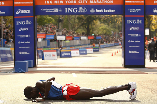
Kenyan Barika Donovani claims first place through hard work and determination of the New York City Marathon located in New York, New York on June 31st, 2018. Barika had ran marathons and competed since she was 3 years old in her home of Malindi, Kenya.

Kenyan Barika Donovani claims first place through hard work and determination of the New York City Marathon located in New York, New York on June 31st, 2018. Barika had ran marathons and competed since she was 3 years old in her home of Malindi, Kenya.
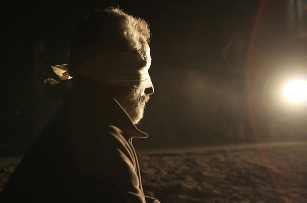
Jonathan Daviosoh is blindfolded in the Saharan desert in North Africa during the solar eclipse on December 22, 2018 while he experiences the presence of the eclipse. Daviosoh has been an astronomer for 20 years at NASA and hadn't yet experienced the hidden depth and beauty of an eclipse.

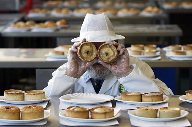
Baker Sailor Halls poses for the judge at the annual Scotland Pie Baking Contest with two of his scotch pies on February 4th, 2018. Halls current bakery is Sweet Eats bakery located in Glasgow, Scotland and he attended the Edinburgh New Town Cookery School in Edinburgh.
2.
1. Rule of thirds- When the subject of the picture is not directly in the middle of the picture. ( Instead they are to the side or on the rule of thirds grid)
2. Balancing Elements- When a photo is "balanced", there are subjects on both sides of the picture with an equal amount of space taken up. (Visible by the eye)
3. Leading Lines- When there are lines in a picture (for Ex a road) that lead to the subject.
4. Symmetry and Patterns (repetition)- When a picture has the same repetitive colors, subjects, pattern, or it is symmetrical
5. Viewpoint- The perspective of how you take a picture.
6. Background- Keeping the background simple so the subject pops out!
7. Create depth- While focusing on a certain subject, making the rest of the photo "longer" can add detail. For example, a picture of a puppy with a blurred background of the mountains tells a story and adds more simplified depth to the picture by having the puppy not be the end of the picture.
8. Framing- When an object in your photo frames your subject.
9. Cropping- When you cut part of your photo off of your photo to make it "smaller", more attractive or less busy.
10. Mergers and avoiding them- A merger is when something merges in the back or foreground with our subject. Avoiding them is important because many times they can confuse what the subject is which can change the meaning of the picture. Also, they look tacky.
3.
Aperture: How much light is let into the camera lens and focus. Changes the lighting of the photo. high aperture: focused with more light low aperture: blurry and less light
ISO: Controls the Exposure. ISO is the sensitivity to light. Low ISO= less sensitivity while High ISO= very sensitive
Shutter Speed: The amount of time the picture is exposed to light. Quick Shutter speed = dark, Slow Shutter speed= bright
4. I think editing the lighting if it is a dark photo is ok, but everything else is unacceptable. You especially shouldn't change the person's skin color, body features or anything in the photo that would portray a different story that is untruthful.
5. Portrait Types
Environmental- A portrait taken in the subject's natural environment that many times shows their job, home or hobbies.
Casual- A portrait taken of someone doing something casual like talking, laughing, walking, or smiling while ***not posing.***
Self- A portrait taken of someone posing or giving a planned facial expression to the camera.
6.
Exposure: The amount of light per unit area that reaches the light sensors within a photographed picture. Determined by the aperture and shutter speed.
Depth of Field: The focus of the photo is your subject with a background that tells a story but is blurred out.
Focal Length: Measures the distance between the len's light and the subject of the photo. Basically, the distance between the subject and image.
7. Magazine Cover Types:
Early- Magazines that developed a long time ago. First magazines ever!
Poster- Magazines that look like posters and are very large. Had barely any words on them, just the image!
Married to Type- Magazines with a big title, a model with a pose, and cover lines all along the sides of the image that are placed around the subject.
Forest of Words- Magazines that have too many words in them, many times covering the subject.

Comments
Post a Comment